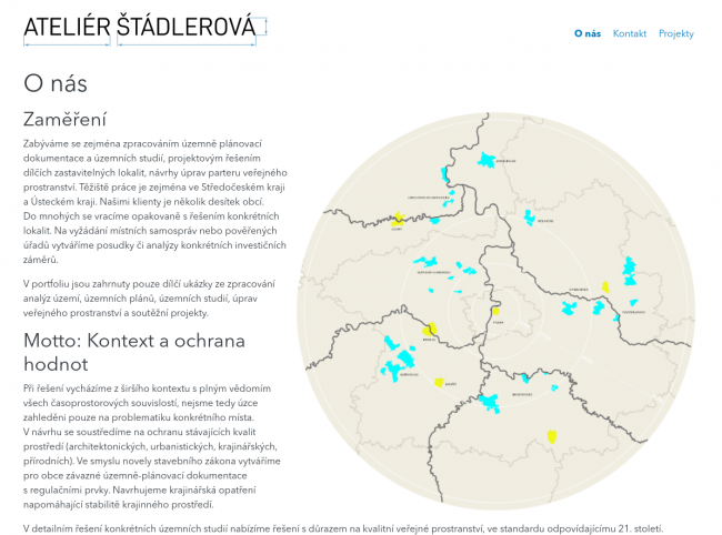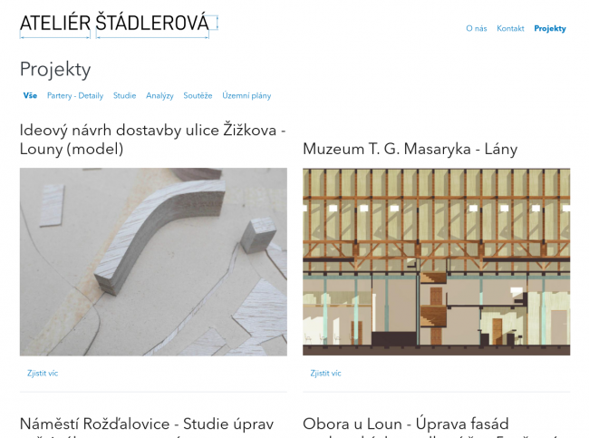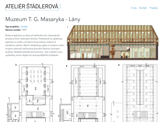
I created a web presentation for architect Michaela Štádlerová. Design is based on her printed portfolio. I liked the pure technical approach of it and wanted to bring the same design on web. Therefore design is based on large white areas with nice and clean typography. A selected font makes an important role together with simple black color accented by blue details. All this brings viewer's focus to drawings, models and other images on the page.
Logo should also remind you technical drawings at the first glance. It's just a text in stencilled font with dimension markings.


