My projects

Here I post my own projects, which I do in my free time. Most of them I do without any financial reward, just as a hobby, for my own need, as a help to my close family or because of an interest in a new technology or tool.

Chrome FlerTop

Submitted by Stopka on

In the year 2012 I switched from using Opera browser to use new Chrome browser. With this change I needed to edit my older Opera extension FlerTop, to be able to use it in the new browser. Fortunately, Chrome extension API is very similar to the Opera one, so it took me only a day to port my extension.

Logo LDTMPP 2012

Submitted by Stopka on

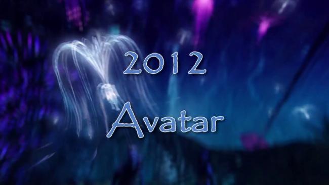
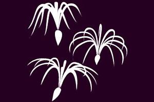
There is a trandition on Pardubice summer camp that children can win as a main price t-shirt with a logo and color based on the theme of the year. In the year 2012 the theme was "Avatar" by the popular movie. My design was chosen for these t-shirts.

This time I got precise instructions how the logo should look like: it had to show the fluff wich is flying in the famous forrest scene.

FlerTop

Submitted by Stopka on

I made a small extension for Opera browser, to advertise randomly selected goods on fler.cz website. They call it "to top" the item, and it means, that the product is listed on the top of the website homepage. Top action is limited to once per some time, given that time is based on the seller reputation score.

Pradubice summer camp 2011 Logo

Submitted by Stopka on

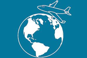
There is this tradition on Pardubice summer camp, that the winning children team gets t-shirts as a main price. T-shirts have a logo and color based on the theme of the year. In the year 2007 the theme was "Around the wold" and my logo design was used.

The original design was similar to what you can see on the picture, but instead of a plane a balloon was floating over the Earth. But our approach to the theme was from more modern perspective, thus we replaced ballon with a plane.

Pardubice summer camp logo

Submitted by Stopka on

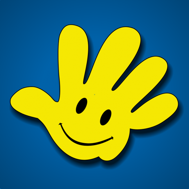
In the year 2009 our summer camp needed a graphical identity. Camp started to use Facebook, got a new web page and camp T-shirts needed unifying logo. 

After several iterations we ended up with a logo in a shape of hand with a smiley face in it. It carries the idea of waving and friendiness, the yellow color should evoke warmness, summer and sun, the smiley face brings happines.